
What they don’t tell you about colour grading…
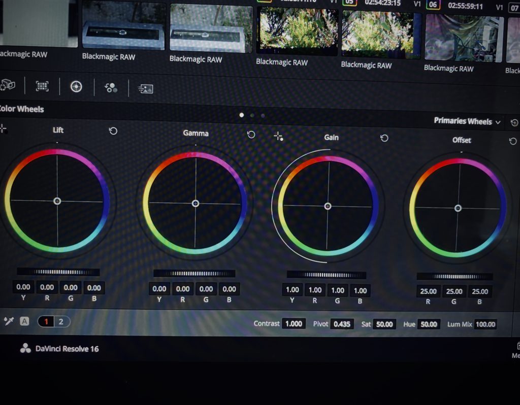
Understanding how images are adjusted by manipulating the shadows, midtones, highlights – which to a colorist are lift, gamma and gain are key to communicating your colorist what you’re looking for with yo images. There’s a wealth of information in your images and understanding what happens when each of these elements are tweaked can save you precious time and money in post production.

It’s easy to practice seeing what these do to your still images on Instagram – the filters are like LUTs. By working out what you can adjust when you edit a photo can help you understand what each does to your image.
If you’re lucky, you’ll have multiple passes of a colour grade per project, but more often than not, you’ll be racing against the clock, so you have to learn to be succinct and direct to get what you need in your allocated colour grading session (s).

My longterm collaborator and partner Ben Allan ACS CSI is both a cinematographer and colorist, so we grade everything in house at our production company, Main Course Films.
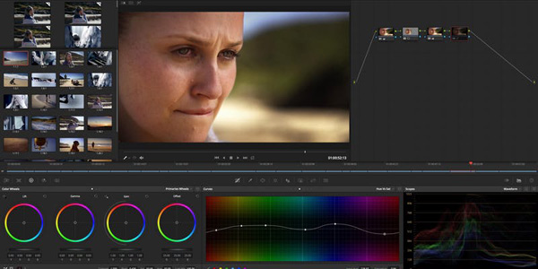
I like colour grading in DaVinci Resolve. I find that the skin tones I’m able to achieve and the precision of grading I can do allows me to produce any look I want. This is, of course, assuming your footage is well exposed to begin with. Because the colour grade is the final polishing stage for your visuals – where the images are locked off – I prefer to shoot log or RAW whenever possible as it gives me the most information in my images to play with in the grade.
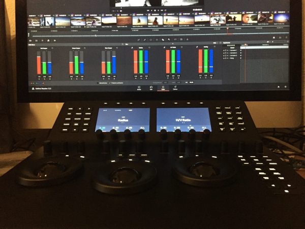
The first pass is like the one light grade we used to have in film rushes. It’s about using broad brush strokes to get the grade in the direction you want. An overall colour balance to start tweaking further.
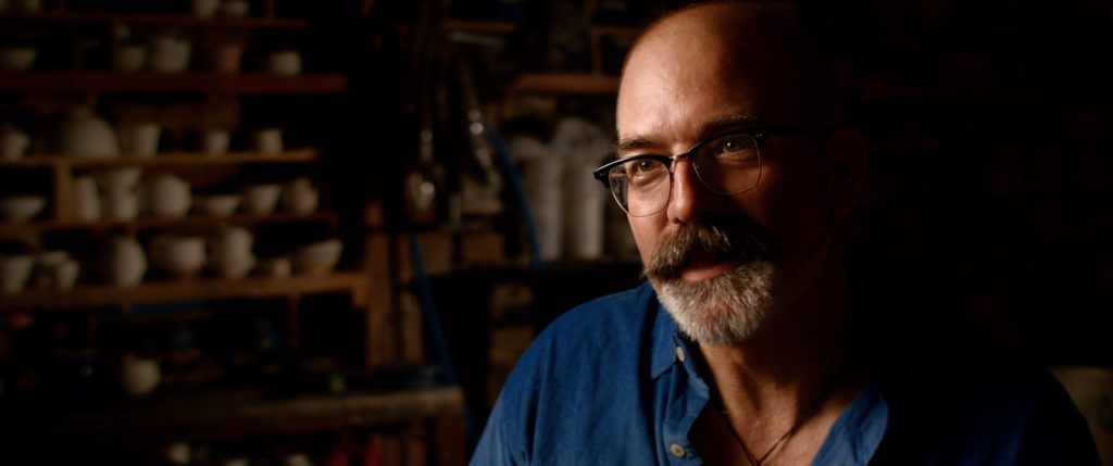
All subsequent passes are just about fine tuning the details right to get what you want. Like anything, the best colour grades are those you have the proper time to make your film perfect, so the time spent in a colour grade should always be in finessing the shot to make it look right, not figuring out the terminology to make this happen.

LUTs
I begin colour grading from pitch stage using LUTs. Literally ‘Look Up Tables’, LUTs are mathematical values going into the camera that emulate the look you want by spitting out another mathematical value going out.
We use custom created LUTS – rather than off-the-shelf LUTs – inspired by the visual references in my Director’s Treatments to create the look I want.
These LUTs are then used during shoot so that everyone – studio/agency, client, talent, crew -understands the look we’ve created. It’s an ongoing means of communicating we are all on the same page and the expectation of the final product is realistic and on brief.

For the grade, the LUT means half the work is done if you’re continuing on in the same direction, but even if I decide to change direction, the LUT is still a shortcut to getting the balance right before we start playing above and under the LUT.
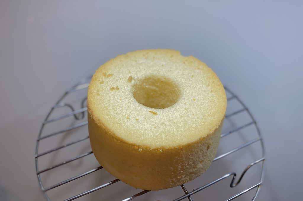
As a foodie, I like to liken the process of colour grading to baking. That is, colour grading is like a sponge cake freshly baked from the oven. To finish the cake, it’s about how you use your skills and tools to create the best finish. LUTS are like the filling or frosting you use on the cake to adjust the flavours to be more like chocolate or almond or green tea etc, but it’s what you add under and above the filling – for example, a dash of liqueur, pastry cream or a tuile that adds the finesse and helps elevate the cake from great to wow.

To continue the cake analogy, if you didn’t bake a great cake to begin with, no matter what you add will only artificially mask it because as soon as you taste it, the cake – in spite of its gorgeous frosting/filling LUT fails. A great ungraded image will still be great, but if the image wasn’t shot well to begin with, as soon as you hit play, the perfect facade falls apart.

CONTRAST & SATURATION
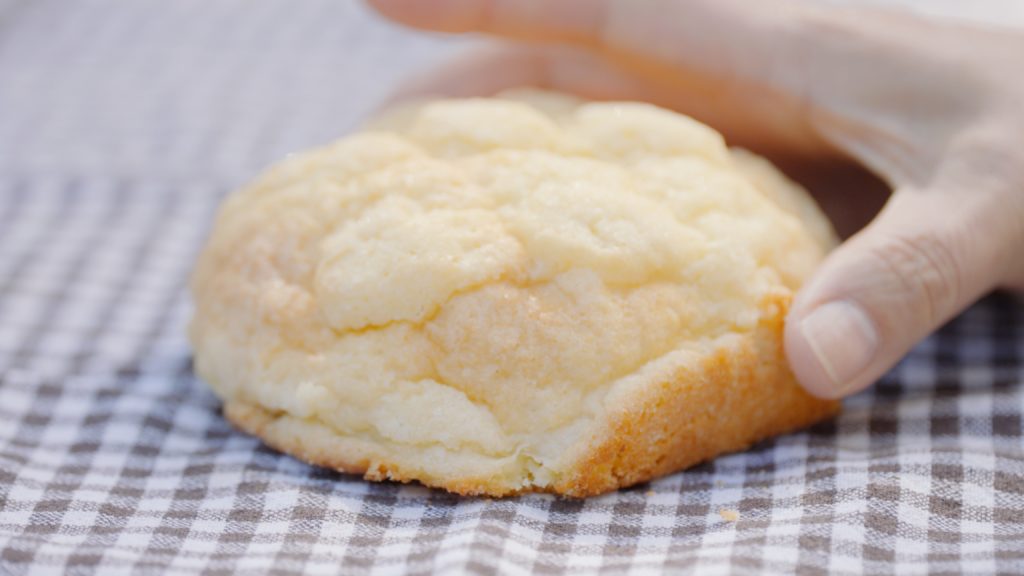
In the days before digital, when you were grading for cinema, there were no contrast or saturation controls at all. Too often today, it’s contrast and saturation that are turned up first which ends up in a mess of your image, because while they will make your image look less bland at first glance, going too far first makes it harder to accurately judge what’s really going on in your grade.
It’s in skin tones in particular that this becomes clear, as you can sometimes just use contrast & saturation to help a landscape shot. But if you simply dial up contrast & saturation on skin tones, the image just looks wrong.
Treading lightly with contrast and saturation will make things clearer because it allows you to properly control all the other elements instead of using it to be an overall ‘fix all’. It’s like using a high powered blender to beat your cream – beat too little you get a slushy mess, beat too much and you get butter, but you beat it just enough you get perfect whipped cream.
It doesn’t take long to quickly add more contrast and saturation at the end of your grade if you feel your image needs it. Playing just enough with your image in a grade helps the overall result look more cinematic, less video-like.

VIGNETTES

Making a vignette work is about making sure you feather ie. soften the edges or your vignette (s) to create a natural look. I love vignettes, and if I have the time, layering my vignettes, and angling for dramatic effect can really help draw the viewer’s eye to where you want them to look without the viewer realising they’re being (colour) manipulated.
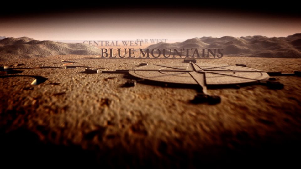
Unless you’re after dramatic effect (like above), the key to vignettes is not to make them noticeable. They should feel organic, and serve to accentuate, not overwhelm an image. There’s an in-joke amongst colorists that I’ve overheard where the best complement you can give a colorist is that you didn’t see the vignette. Conversely, the worst thing you can say is that you saw the vignette.
GRADS
Grads are like a straight vignette that you can create to darken or light up a corner or foreground, upper third of a shot etc. They’re great for not wanting to create something less than a vignette window to add depth or a layer of complexity to a shot.

Upside down lower grads in particular, can help a shot such as an exterior location shot feel more grounded and settled.
EYELIGHT
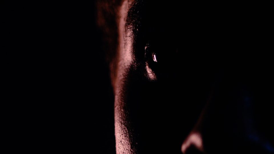
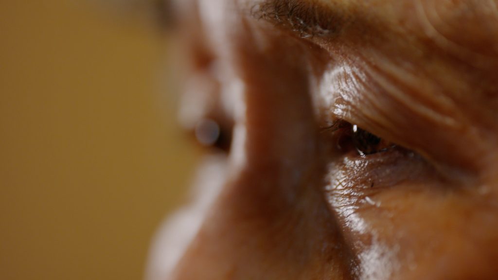
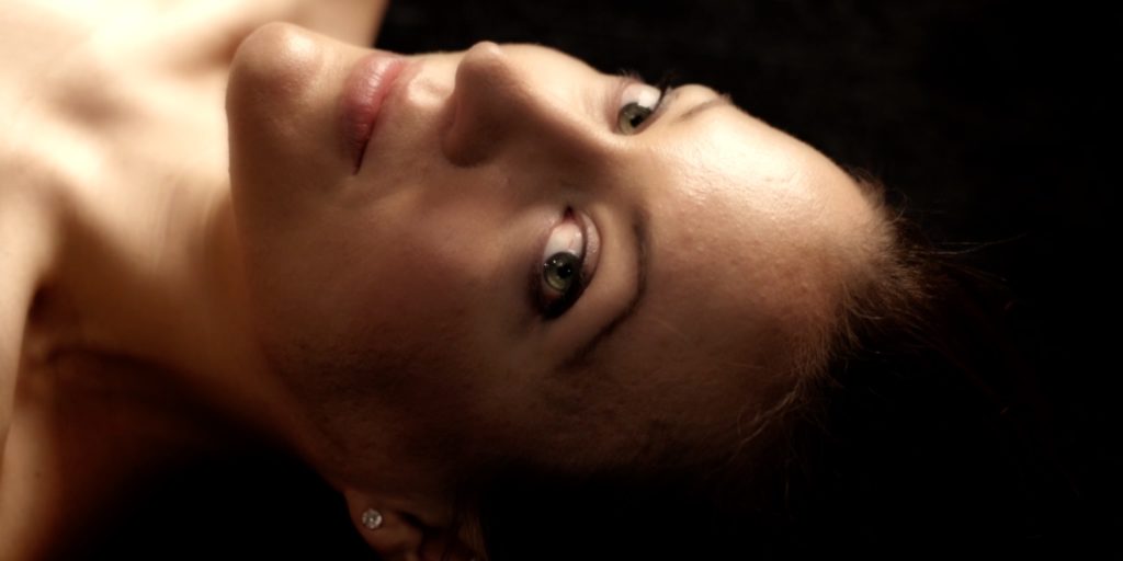
Cinematographer/Colorist Ben Allan ACS CSI and I first saw digital eye-light in action on the Baselight in London in 2006. We were blown away by how grading could be used to add extra light on the eyes so the actors eyes really popped. The degree to which you graded meant the look was either magical or just subtly luminous – either way, an incredibly flattering look. Today, Resolve makes adding eye-light instead of just possible.
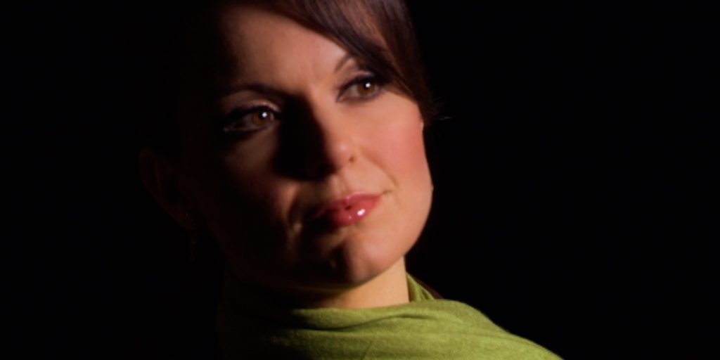
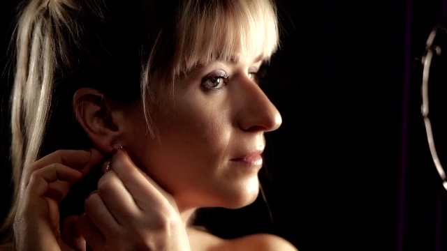
Our eyes tell us so much about how we’re feeling. They often become smaller when we’re feeling sad or anxious, or twinkle and widen when we’re excited and happy. This is why eye-light – bringing extra luminance (and hence attention) to the eye by guiding the viewer through color grading is a powerful tool for directors in telling their stories as they help the viewer empathise and connect with their characters’.
STAYING COLOUR NEUTRAL
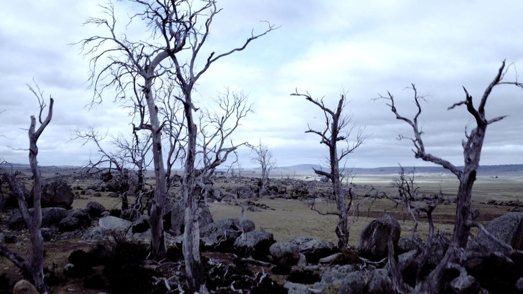
I also like flipping back and forth from the original to the graded image to make sure it’s the graded image I prefer. If I don’t, we save this image as a variation, and start fresh, then compare again. By narrowing down your choices to only two versions, you’re better placed to make the right decision rather than being overwhelmed by choices.
The color grade should be a fun, satisfying process, because this is what you and your cinematographer have been working so hard during pre and shoot to capture. And with so many tools to play with now, the grade is only constrained by how long you’ve got to play.

